
Sharp corners feel technical; rounded corners feel friendly. This free border radius generator gives each corner its own slider, so you can round one corner, two, or all four — and preview the shape live before you copy the CSS.
It works entirely in your browser, so nothing is uploaded and there is no account to create. Use it for cards, buttons, avatars and images, then add depth with the Box Shadow Generator or build a frosted panel with the Glassmorphism Generator.
How to use
- Drag the four corner sliders to round each corner separately.
- Switch between pixels and percent for the radius unit.
- Watch the preview box update live as you drag.
- Click Copy CSS and paste the rule into your stylesheet.
Why use Toolsvine
Writing four corner values by hand is slow, and a typo in the order is easy to miss. This tool shows the shape as you drag, so the radius you see is the radius you get. It is free, private, and the output is standard CSS that every modern browser understands.
How does border-radius work?
The CSS border-radius property rounds the corners of any element. One value rounds all four corners; four values round them in clockwise order starting at the top left: top-left, top-right, bottom-right, bottom-left. You can also give two values separated by a slash — the first set controls the horizontal radius, the second the vertical radius — which makes elliptical corners.
The clockwise order is the detail most people get wrong, and it matters: border-radius: 16px 4px 16px 4px rounds the top-left and bottom-right corners and leaves the other two nearly sharp, which is a classic diagonal look for cards. The tool outputs the values in that order, so you can paste the result without reordering anything.
Common radius values
| Element | Typical radius |
|---|---|
| Button | 6–10px |
| Card | 12–16px |
| Avatar (circle) | 50% |
| Pill badge | 999px |
Percentages are relative to the element's own width and height, so 50% on a square makes a perfect circle, while 50% on a wide rectangle makes an ellipse. For a consistent look, pick two or three radii — small, medium, large — and reuse them across your whole design instead of inventing a new value for every component.
Worked example: a card, a circle, and an ellipse
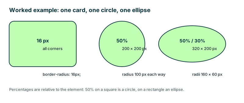
Start with the tool's default: all four corners at 16 px on a 320 × 200 px card, giving border-radius: 16px 16px 16px 16px. Then change the unit to percent: on a 200 × 200 px avatar, 50% means a radius of 100 px on every side — a perfect circle.
On the same 320 × 200 px card, 50% / 30% gives an ellipse instead: a horizontal radius of 160 px (50% of 320) and a vertical radius of 60 px (30% of 200).
| Element | Size | Radius | Result |
|---|---|---|---|
| Card | 320 × 200 px | 16 px | Softly rounded corners |
| Avatar | 200 × 200 px | 50% | Circle, radius 100 px |
| Banner | 320 × 200 px | 50% / 30% | Ellipse, radii 160 × 60 px |
The pill badge shows the same idea at an extreme: border-radius: 999px on a button makes the ends fully round no matter how wide the button grows, because the radius is always larger than half the height. That is why design systems use 999 px for pills instead of a percentage — it never turns into an ellipse when the text gets longer.
Frequently asked questions
What does border-radius: 50% do?
On a square element it makes a perfect circle, because each corner's radius is half the width and half the height. On a rectangle the same 50% makes an ellipse. For a circle, keep the element square — a 200 × 200 px avatar at 50% is a circle with a 100 px radius.
In what order do the four values go?
Clockwise from the top left: top-left, top-right, bottom-right, bottom-left. This tool outputs them in that order, so you can paste the result without reordering anything. One value rounds all four corners, two values round the top-left and bottom-right together, and three values leave one corner to inherit.
Can corners be elliptical?
Yes. Give a horizontal and a vertical radius separated by a slash, like border-radius: 50% / 30%. This tool generates circular corners; add the slash form by hand if you need an ellipse. On a 320 × 200 px element, 50% / 30% gives radii of 160 px horizontally and 60 px vertically.
Does border-radius clip images inside?
Yes, as long as the image is inside the rounded element and the element has overflow: hidden. The radius clips the content to the rounded shape automatically. Without overflow: hidden, a child image can stick out past the rounded corner even though the border itself is round.
Is my work uploaded anywhere?
No. The preview and CSS are generated in your browser only. Nothing leaves your device, so your design stays private, and the tool keeps working offline once the page has loaded. There is no account and no server copy of your work.