
Flat text can disappear on a busy photo or a bright background. This free text shadow generator adds depth, glow or a crisp outline to any heading with a few sliders, and shows the result live on sample text. Copy the finished text-shadow rule and paste it into your CSS.
It runs entirely in your browser — no uploads, no account, no waiting. Match it with a Box Shadow Generator effect on the card behind the text, or cut the text's container into a shape with the Clip-Path Generator.
How to use
- Type your own sample text or keep the default headline.
- Drag the offset, blur and color sliders until the effect looks right.
- Try a glow preset for neon text, or a hard offset for a retro look.
- Click Copy CSS and paste the rule into your stylesheet.
Why use Toolsvine
Text shadows are easy to overdo: one wrong number and a heading turns muddy. This tool shows the effect on real text as you drag, so you can stop at the exact point where the shadow adds depth without hurting readability. It is free, private and produces standard CSS that works everywhere.
How does text-shadow work?
The CSS text-shadow property takes a horizontal offset, a vertical offset, a blur radius and a color. Unlike box-shadow it has no spread value, but you can stack several shadows with commas — for example a dark shadow for depth plus a colored one for glow. Shadows are drawn behind the text, so the letters themselves stay sharp.
The missing spread value is the key difference from box shadows: a text shadow is always the same size as the glyphs, so a large blur does not grow the shape, it just fades it. That makes text shadows safer for readability — they can soften a heading without swallowing neighboring lines the way a big box shadow can.
Popular text-shadow recipes
| Effect | Typical values |
|---|---|
| Soft drop shadow | 2px 2px 4px rgba(0,0,0,0.4) |
| Neon glow | 0 0 8px #0ff, 0 0 24px #0ff |
| Retro hard shadow | 4px 4px 0 #111 |
| Letterpress | 0 1px 0 rgba(255,255,255,0.6) |
Readability comes first: a shadow should increase contrast between text and background, not decorate for its own sake. On photographs, a soft dark shadow is usually enough; on dark backgrounds, a light glow can lift thin fonts. Test at the real font size, because a shadow that looks fine at 48 pixels may vanish at 16.
Worked example: a headline over a photo
A travel site puts the headline "Summer Sale" over a bright beach photo at 48 px. White text alone disappears into the sand, so the tool's default shadow is applied: 2 px right, 2 px down, 4 px blur, black at 40% opacity. The letters stay white and sharp while a soft gray halo separates them from the photo.
| Effect | CSS | When to use it |
|---|---|---|
| Drop shadow | 2px 2px 4px rgba(0,0,0,0.4) | Headlines over photos |
| Neon glow | 0 0 8px #0ff, 0 0 24px #0ff | Dark backgrounds, signs |
| Hard offset | 4px 4px 0 #111 | Retro posters, stickers |
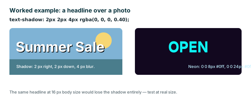
For the neon version, the trick is the pair: a tight 8 px glow hugs the letters and a wide 24 px glow spreads the color, so the text reads as lit rather than blurred. One wide glow alone looks like fog; one tight glow alone looks like a thick outline. And if the caption under the photo is only 16 px, skip the shadow or shrink it to 1 px 1 px 2 px — the 48 px recipe is too heavy for body text.
Frequently asked questions
Does text-shadow work in all browsers?
Yes. text-shadow is supported in all modern browsers with no prefix. The code from this tool is plain CSS and works on headings, buttons and any other text. It degrades gracefully too: a browser that cannot draw the shadow simply shows the plain text, which is still readable.
How do I make glowing neon text?
Set both offsets to 0, pick a bright color, and use a medium blur. Stacking two shadows with the same color — one tight, one wide — makes the glow stronger without blurring the letters themselves. Try 0 0 8px #0ff plus 0 0 24px #0ff on a near-black background for the classic neon sign look.
Can I add more than one shadow?
Yes, separate shadows with commas. This tool generates a single shadow; copy it and add extra comma-separated shadows by hand for layered glow or outline effects. A dark drop shadow plus a colored glow is a common pair: depth from the first, color from the second.
Will a text shadow hurt readability?
It can if it is too strong or the wrong color. Keep the blur modest and choose a shadow color that contrasts with the background — dark on light photos, light on dark photos — and check the result at the size people will actually read. A shadow that helps a 48 px headline can muddy 16 px body text.
Is anything I type uploaded?
No. Everything runs locally in your browser and your text never leaves your device. The preview, the sliders and the copied CSS are all computed on your own machine, so a headline you have not published yet stays private and no server ever sees it.