
Rectangles are boring. This free clip-path generator cuts any element into a triangle, hexagon, arrow, circle, ellipse or custom inset shape, with a live preview on a colored panel. Copy the finished clip-path rule and paste it into your CSS.
Everything runs in your browser — nothing is uploaded and no account is needed. Use clipped shapes for hero images, badges and section dividers, then animate them with the CSS Animation Keyframes Generator or round a plain box first with the Border Radius Generator.
How to use
- Choose a shape: polygon, circle, ellipse or inset.
- Pick a preset polygon or drag the sliders to shape it yourself.
- Watch the preview panel clip live as you adjust it.
- Click Copy CSS and paste the rule into your stylesheet.
Why use Toolsvine
Clip-path coordinates are percentages that are hard to picture from numbers alone. This tool draws the shape as you change it, so a hexagon or arrow is one click away instead of a geometry exercise. It is free, private and outputs standard CSS.
How does clip-path work?
The CSS clip-path property cuts an element to a shape: everything outside the shape is hidden. A polygon() takes a list of x/y point pairs as percentages of the element's box; a circle() takes a radius and a center; an ellipse() takes two radii; and inset() trims a rectangle in from each edge, optionally with rounded corners.
Percentages are the key to why clip-path is so flexible: a hexagon defined in percentages keeps its proportions when the element resizes, so the same rule works on a 300 px badge and a 900 px hero image. Pixel values would stretch or crop instead — which is why this tool outputs percentages for every polygon.
Common clip-path shapes
| Shape | Example value |
|---|---|
| Triangle | polygon(50% 0, 100% 100%, 0 100%) |
| Hexagon | polygon(25% 0, 75% 0, 100% 50%, 75% 100%, 25% 100%, 0 50%) |
| Circle | circle(50% at 50% 50%) |
| Diagonal section | polygon(0 0, 100% 0, 100% 85%, 0 100%) |
Clipping is visual only: the element still occupies its original rectangular box in the layout, and clipped-away areas do not receive clicks. That makes clip-path ideal for decorative shapes, image masks and angled section edges — but do not use it to hide content that must remain reachable, because screen readers and keyboard users can still reach it.
Worked example: a hexagon badge on a 300 × 260 px image
Take a 300 × 260 px product photo and clip it to a hexagon with clip-path: polygon(25% 0, 75% 0, 100% 50%, 75% 100%, 25% 100%, 0 50%). Each percentage turns into a pixel coordinate: 25% of 300 px is 75 px, 75% is 225 px, and 50% of 260 px is 130 px.
| Point | Percentage | Pixels on 300 × 260 |
|---|---|---|
| Top edge, left | 25% 0 | (75, 0) |
| Top edge, right | 75% 0 | (225, 0) |
| Right point | 100% 50% | (300, 130) |
| Bottom edge, right | 75% 100% | (225, 260) |
| Bottom edge, left | 25% 100% | (75, 260) |
| Left point | 0 50% | (0, 130) |
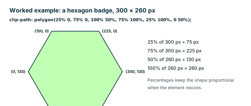
The same rule on a 600 × 520 px image produces exactly the same hexagon, just twice as big — the percentages scale with the box. That is the whole advantage of clip-path over cropping an image in an editor: one rule, every size, and you can animate between two shapes with the same number of points, so the badge can morph into a diamond on hover.
Frequently asked questions
Does clip-path work in all browsers?
Yes, in all modern browsers. The basic shapes — polygon, circle, ellipse and inset — are supported in Chrome, Firefox, Safari and Edge with no prefix. Very old browsers ignore the property and show the unclipped rectangle, so the content is still visible even if the shape is not.
Can I animate a clip-path?
Yes, with CSS transitions or animations, as long as the start and end shapes have the same number of points. A circle can grow into a bigger circle, and a polygon can morph into another polygon with the same point count. A hexagon cannot morph into a triangle, because the point counts do not match.
Why can't I click the clipped-away area?
Clipping removes the area from hit-testing, so clicks pass through to whatever is underneath. That is by design — use it for decoration, not for hiding interactive content. If a button must stay clickable, keep it inside the visible shape or do not clip its container at all.
What units do polygon points use?
Percentages of the element's own width and height. 50% 0 is the top center, 100% 100% is the bottom-right corner. Percentages keep the shape proportional when the element resizes. On a 300 × 260 px image, 25% is 75 px across and 50% is 130 px down.
Is anything uploaded?
No. The preview and code are generated locally in your browser. Nothing leaves your device, and the tool works offline once loaded. Your images stay private — the tool only needs their size to draw the preview, if you load one at all.