
A good shadow makes a card, button or modal feel like it floats above the page. This free box shadow generator lets you tune the horizontal and vertical offset, blur, spread, color and opacity with sliders, and watch the preview update instantly. When it looks right, copy the finished CSS straight into your stylesheet.
Everything runs in your browser, so there is nothing to install and nothing is uploaded. Pair it with a matching Text Shadow Generator effect for your headings, or round the card's corners first with the Border Radius Generator so the shadow follows the shape.
How to use
- Move the sliders for offset, blur, spread and color until the preview looks right.
- Toggle the inset switch if you want an inner shadow instead of an outer one.
- Check the shadow on both light and dark preview backgrounds.
- Click Copy CSS and paste the rule into your stylesheet.
Why use Toolsvine
Shadows are fiddly to write by hand because four numbers and a color have to agree before the result looks good. This tool shows the result as you drag, so you can judge a shadow by eye instead of guessing numbers, re-saving and refreshing. It is free, needs no account, and the code it produces is plain CSS that works in every modern browser.
How does box-shadow work?
The CSS box-shadow property takes up to five values: horizontal offset, vertical offset, blur radius, spread radius and color. A vertical offset drops the shadow below the element, a large blur makes it soft and diffuse, and spread grows or shrinks the shadow's footprint. Add the keyword inset at the start and the shadow is drawn inside the element instead.
Think of a real object on a table: the shadow is offset in the direction away from the light, it softens as the object lifts higher, and it grows fainter with distance. CSS shadows imitate exactly that — offset for direction, blur for height, opacity for how much light the object blocks. That is why the most realistic shadows are barely visible.
Common shadow recipes
| Effect | Typical values |
|---|---|
| Subtle card lift | 0 2px 8px rgba(0,0,0,0.12) |
| Floating modal | 0 16px 48px rgba(0,0,0,0.25) |
| Button press depth | 0 4px 0 rgba(0,0,0,0.2) |
| Inner well | inset 0 2px 6px rgba(0,0,0,0.2) |
Layering helps: two shadows, one short and sharp and one long and soft, look more realistic than a single heavy shadow. Keep the opacity low — most real shadows are barely visible — and reuse the same shadow scale across a site so cards, dialogs and menus feel like they belong to one system.
Worked example: a floating card
Take a 320 × 150 px card and apply the tool's default shadow: 0 px across, 10 px down, 20 px blur, 0 px spread, black at 25% opacity. The shadow sits under the card, and because the blur spreads 20 px past the 10 px offset, it reaches about 30 px below the card's bottom edge.
| Value | Number | What it does |
|---|---|---|
| Horizontal offset | 0 px | Shadow stays centered under the card |
| Vertical offset | 10 px | Shadow starts 10 px below the card |
| Blur radius | 20 px | Softens the edge over 20 px |
| Spread | 0 px | Shadow is the same size as the card |
| Color | rgba(0,0,0,0.25) | Black at 25% opacity |
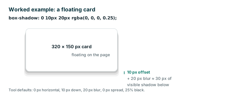
If the shadow looks too heavy, lower the opacity to 0.12 or 0.15 before touching anything else — opacity is almost always the problem, not the offset. And if the card needs to feel higher off the page, raise the blur to 32 px and the offset to 16 px together: a big blur with a small offset looks like fog, while a big offset with a small blur looks like a hard stamp.
Frequently asked questions
Does the generated box-shadow work in all browsers?
Yes. box-shadow is supported in every modern browser, including Chrome, Firefox, Safari and Edge, with no prefix needed. The code this tool produces is plain CSS, so paste it into any stylesheet. Even Internet Explorer 9 supported it, so you will not meet a browser that cannot draw these shadows.
What is the difference between blur and spread?
Blur softens the edge of the shadow: a bigger blur radius fades it out over a wider area. Spread grows or shrinks the whole shadow shape — a positive spread makes it larger than the element, a negative one makes it smaller. Use blur for softness and spread for size.
How do I make an inner shadow?
Turn on the inset toggle. The shadow is then drawn inside the element's border box, which is useful for pressed buttons, input fields and wells. The same offset, blur and spread sliders apply, but the effect reads as depth carved into the surface instead of a shadow cast onto the page.
Can I use several shadows on one element?
Yes — separate multiple shadows with commas and the browser draws them in order. This tool generates one shadow at a time; copy it, then add a second shadow rule by hand for a layered effect. A short sharp shadow plus a long soft one is the classic recipe for a realistic floating card.
Is my design uploaded anywhere?
No. The preview and the CSS are generated entirely in your browser. Nothing leaves your device, and the tool keeps working offline once the page has loaded. Your design choices stay private, and the CSS you copy is yours to use anywhere.