
The difference between a cheap-feeling animation and a polished one is usually the easing curve. This free cubic-bezier generator gives you a visual curve editor with presets — ease, ease-in, ease-out and ease-in-out — plus an animated demo box so you can feel each curve before you copy it.
It runs entirely in your browser; nothing is uploaded and no account is needed. Once the motion feels right, copy the cubic-bezier() value into your transitions — and build the full animation around it with the CSS Animation Keyframes Generator or shape the element first with the Clip-Path Generator.
How to use
- Drag the two control handles to reshape the easing curve.
- Or click a preset: ease, ease-in, ease-out or ease-in-out.
- Press Play demo to watch the box animate with your curve.
- Click Copy CSS and paste the value into your transition.
Why use Toolsvine
Easing curves are four numbers that are almost impossible to judge from digits alone. This tool draws the curve and animates a real box with it, so you can feel the difference between a gentle start and a snappy finish. It is free, private and outputs standard CSS.
How does cubic-bezier work?
An easing curve is defined by two control points, P1 (x1, y1) and P2 (x2, y2), inside a unit square where x is time and y is progress. The curve starts at (0, 0) and ends at (1, 1). If it rises steeply at first, the animation starts fast; if it stays flat, the animation starts slowly and finishes quickly.
Read the curve like a speedometer: the slope at any point is the speed. A steep slope means the element is moving fast at that moment; a flat slope means it is barely moving. Ease-out starts steep and flattens — fast, then slowing to a stop — which is why entrances feel natural with it: real objects do not stop instantly, they settle. The x values must stay between 0 and 1, while y values may overshoot for a bounce-like effect.
Standard easing presets
| Preset | Values | Feels like |
|---|---|---|
| ease | 0.25, 0.1, 0.25, 1 | Gentle start and end |
| ease-in | 0.42, 0, 1, 1 | Slow start, fast finish |
| ease-out | 0, 0, 0.58, 1 | Fast start, soft landing |
| ease-in-out | 0.42, 0, 0.58, 1 | Slow both ends |
Use ease-out for things entering the screen, ease-in for things leaving, and ease-in-out for movement between two visible states. Keep durations short — 150 to 300 milliseconds for interface motion — and respect prefers-reduced-motion by disabling non-essential animation for users who ask for it.
Worked example: a 240 px slide-in over 300 ms
A sidebar slides 240 px into view over 300 ms with ease-out, cubic-bezier(0, 0, 0.58, 1). Because the curve rises fast, the panel covers most of the distance early: at 75 ms it has moved 91 px (37.8%), at 150 ms 164 px (68.5%), and at 225 ms 218 px (90.7%).
A linear animation would cover only 60, 120 and 180 px at the same moments — the same duration, but none of the urgency. That front-loaded motion is exactly why ease-out feels responsive: the user sees movement almost immediately, and the last 60 ms are spent settling the final 22 px.
| Time | Ease-out distance | Linear distance |
|---|---|---|
| 75 ms (25%) | 91 px (37.8%) | 60 px (25%) |
| 150 ms (50%) | 164 px (68.5%) | 120 px (50%) |
| 225 ms (75%) | 218 px (90.7%) | 180 px (75%) |
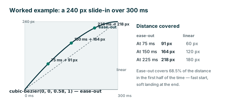
If the same slide used ease-in instead, the panel would barely move for the first 100 ms and then rush in at the end — the classic "laggy" feeling that makes an interface seem slow even when the duration is identical.
Frequently asked questions
What is a cubic-bezier curve?
A mathematical curve with two control points that describes how an animation progresses over time. The CSS function cubic-bezier(x1, y1, x2, y2) plugs straight into transition-timing-function or animation-timing-function. The x values are time, the y values are progress, and the shape of the curve is the feel of the motion.
Which easing should I use for a button hover?
ease-out is usually best: the change starts immediately and settles softly. Ease-in feels sluggish on hover because nothing seems to happen at first. For a button, pair ease-out with a short duration — 150 to 200 ms — so the feedback feels instant without being twitchy.
Can y values go outside 0 to 1?
Yes. y values below 0 or above 1 make the animation overshoot its target and come back, which creates anticipation or bounce effects. The x values must stay between 0 and 1 or the curve is invalid. A y of 1.2 on the second control point gives a gentle overshoot that settles back.
Why does my animation still feel wrong?
Check the duration as well as the curve: even perfect easing feels bad at 2 seconds for a button hover. Try 150–300 ms for UI motion and up to 600 ms for larger entrances. If the motion still feels off, compare it with the linear reference in the chart — the difference usually points at the curve, not the timing.
Is anything uploaded?
No. The editor and demo run entirely in your browser. Nothing leaves your device, and your animation choices stay private, since the curve and the copied CSS are computed locally with no server involved. The tool keeps working offline once the page has loaded.