
Writing @keyframes by hand means juggling percentages, transforms and timing in your head. This free CSS animation keyframes generator lets you build an animation from two or more keyframes — opacity, movement, scale and rotation — and watch it loop live on a demo box before you copy the code.
Everything runs in your browser; nothing is uploaded and no account is needed. Use it for loaders, attention-grabbing badges and hero entrances, then tune the feel with the Cubic Bezier Generator or shape the animated element with the Clip-Path Generator.
How to use
- Name your animation and set its duration and loop count.
- Define at least two keyframes: pick a percentage and a property value for each.
- Watch the demo box loop your animation live.
- Click Copy CSS to copy the @keyframes rule and the class that uses it.
Why use Toolsvine
Keyframes are easy to get subtly wrong — a missing percent sign or a transform that jumps at the loop point. This tool previews the loop exactly as a browser will play it, so a jump is visible before the code ever reaches your site. It is free, private and outputs standard CSS.
How does @keyframes work?
A @keyframes rule names an animation and lists what an element should look like at chosen points in time, from 0% (or from) to 100% (or to). The browser interpolates smoothly between keyframes. The animation is applied with the animation shorthand: name, duration, timing function and iteration count — for example animation: float 2s ease-in-out infinite.
Each keyframe is a snapshot, and the browser fills in the frames between them. With only 0% and 100% the animation is a simple two-state tween, like a fade. Add a 50% keyframe and you get a three-act motion: out, peak, and back — which is how loops, bounces and pulses are built.
Common keyframe effects
| Effect | Keyframes |
|---|---|
| Fade in | 0% opacity 0 → 100% opacity 1 |
| Float up | 0% translateY 0 → 50% translateY -12px → 100% translateY 0 |
| Pulse | 0% scale 1 → 50% scale 1.1 → 100% scale 1 |
| Spin | 0% rotate 0deg → 100% rotate 360deg |
For a seamless loop, the first and last keyframes should match — otherwise the element snaps back at the end of each cycle. Animate transform and opacity where possible: they are the cheapest properties for a browser to animate and keep motion smooth on phones. And always respect prefers-reduced-motion for users who prefer still pages.
Worked example: a floating badge
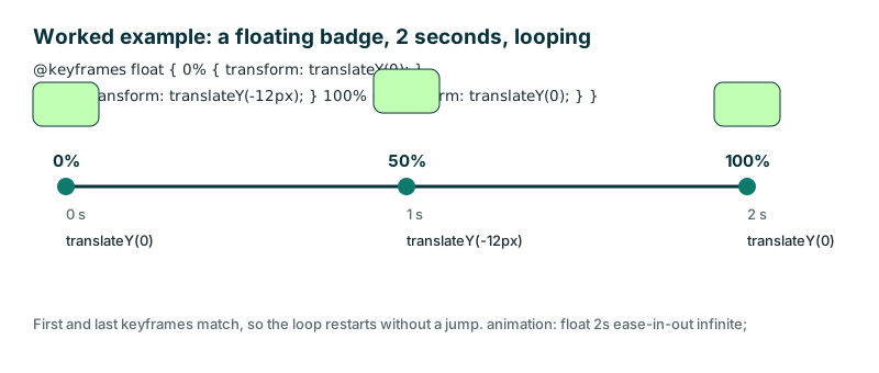
Take the tool's defaults: an animation named "float", 2 seconds long, looping forever — animation: float 2s ease-in-out infinite. The keyframes move the badge up 12 px and back: at 0 seconds translateY(0), at 1 second translateY(-12px), and at 2 seconds translateY(0).
The first and last keyframes match, so the loop restarts without a jump — the badge is exactly where it started when the next cycle begins.
| Time | Keyframe | Position |
|---|---|---|
| 0 s | 0% | translateY(0) |
| 1 s | 50% | translateY(-12px) |
| 2 s | 100% | translateY(0) |
Change the last keyframe to translateY(-6px) and the badge would snap 6 px downward at every loop — a small jump, but one your eye catches instantly, which is exactly what the live preview is for.
Frequently asked questions
What is the difference between transition and animation?
A transition animates a change between two states, like a hover. An animation runs a sequence of keyframes on its own, can loop, and can have many steps in between — which is what this tool builds. Use a transition for reactions to the user, and an animation for motion that plays by itself, like a loader or a floating badge.
How do I make an animation loop forever?
Set the iteration count to infinite in the animation shorthand, like animation: float 2s ease-in-out infinite. This tool's preview loops by default so you can check the loop point. For a seamless loop, make the first and last keyframes identical, or the element will snap back at every restart.
Why does my animation jump at the end?
The last keyframe does not match the first, so the element snaps back when the loop restarts. Make 0% and 100% identical — this tool's preview makes the jump obvious before you copy the code. A float that ends at translateY(-6px) instead of 0 will jump 6 px at every cycle.
Which properties are cheapest to animate?
transform and opacity. They run on the compositor and stay smooth on phones. Animating width, height, margin or top forces layout recalculation every frame and often stutters. If a motion feels janky on a phone, check whether you are animating a layout property and switch it to a transform.
Is anything uploaded?
No. The builder and preview run entirely in your browser and nothing leaves your device. Your animation settings stay private, and the tool keeps working offline once the page has loaded, with no account and no server copy of your work.