
Frosted-glass cards — translucent panels with a soft blur behind them — are everywhere in modern interfaces. This free glassmorphism generator lets you tune the blur, background transparency, border and corner radius over a colorful demo background, and copy the finished CSS in one click.
Everything runs locally in your browser; no file is uploaded and no account is needed. When the panel looks right, round it with the Border Radius Generator values or add lift with the Box Shadow Generator so the glass floats above the page.
How to use
- Drag the blur slider until the background behind the panel turns frosted.
- Set the background opacity so text stays readable over the demo art.
- Adjust the border, radius and shadow to taste.
- Click Copy CSS and paste the block into your stylesheet.
Why use Toolsvine
Glassmorphism has four numbers that must agree — blur, opacity, border and radius — and guessing them in a text editor is slow. This tool shows the frosted panel over a real gradient background as you drag, so you can judge readability at a glance. It is free, private and outputs plain CSS.
How does glassmorphism work?
Glassmorphism is built from three CSS ideas. backdrop-filter: blur() blurs whatever sits behind the element, a semi-transparent background (an rgba color with a low alpha) tints the panel, and a thin light border sells the glass edge. Without the blur it is just a translucent box; without the tint, the text can vanish into the background.
The blur is the part people misunderstand: backdrop-filter blurs the content behind the element, not the element itself, so the panel's own text stays sharp while the gradient or photo behind it turns frosty. That is what makes the effect feel like looking through glass rather than looking at a faded box.
The core recipe
| Property | Typical value |
|---|---|
| backdrop-filter | blur(12px) |
| background | rgba(255,255,255,0.15) |
| border | 1px solid rgba(255,255,255,0.3) |
| border-radius | 16px |
Keep the blur modest — 8 to 16 pixels is usually enough — and keep text contrast high, because a frosted panel over a busy photo can still be hard to read. Note that backdrop-filter needs a background to blur; on a plain solid page background the effect is invisible, so this style shines over gradients, photos and video.
Worked example: a frosted sign-in card
Take the tool's defaults over a purple-to-orange gradient: blur 12 px, background opacity 15%, border radius 16 px, border 1 px. Those four numbers are the whole recipe — the blur frosts the gradient behind the panel while the 15% white tint keeps the text readable. The tool outputs exactly this CSS, ready to paste:
background: rgba(255, 255, 255, 0.15);
backdrop-filter: blur(12px);
-webkit-backdrop-filter: blur(12px);
border-radius: 16px;
border: 1px solid rgba(255, 255, 255, 0.3);
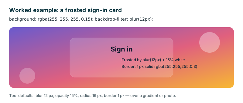
The -webkit-backdrop-filter line is there for older Safari, which needed the prefix — include it and the card works back to Safari 9. If the card will sit over a photo instead of a gradient, raise the opacity to 0.25 and darken the text to #0f172a: the frost still shows, but the words stay readable even where the photo is brightest.
Frequently asked questions
What is glassmorphism?
A design style where panels look like frosted glass: semi-transparent, with the background blurred behind them and a thin light border. It is common in modern dashboards, music apps and weather widgets. The three ingredients are backdrop-filter blur, a translucent background, and a light border — remove any one and the glass look collapses.
Does backdrop-filter work in all browsers?
It works in all modern browsers — Chrome, Edge, Firefox and Safari. Older browsers ignore it gracefully and show a plain translucent panel, so always pick a background color that stays readable without the blur. This tool includes the -webkit- prefix for older Safari, which needed it.
Why does my glass panel look invisible?
Usually because there is nothing colorful behind it to blur. Glassmorphism needs a gradient, photo or pattern underneath. If the page background is a flat color, the blur has nothing to show. Put the panel over a vivid gradient or a photo and the frost appears immediately.
How do I keep text readable on glass?
Raise the background opacity a little, use a darker tint behind light text, and add a subtle shadow under the text. Test over the busiest part of your background, not the calmest. A panel that reads fine over a calm sky can vanish over a busy crowd photo, so check the worst spot.
Is anything uploaded?
No. The demo and the CSS are generated in your browser and nothing leaves your device. The gradient, the sliders and the copied code are all local, so a design you have not shipped yet stays private and no server ever sees it.