
Neumorphism — soft UI — makes buttons and cards look pressed out of the background itself, using two shadows instead of borders. This free neumorphism generator lets you pick a light or dark background, then tune the shadow distance, blur and intensity live until the shape feels extruded or pressed in.
It runs entirely in your browser with no uploads and no account. When the effect looks right, copy the CSS and use it on buttons and cards — and add a soft outer lift with the Box Shadow Generator or round the shape first with the Border Radius Generator.
How to use
- Pick a light or dark background color for the demo.
- Drag distance, blur and intensity until the shape looks raised.
- Switch between raised, pressed-in and flat styles.
- Click Copy CSS and paste the rule into your stylesheet.
Why use Toolsvine
Neumorphism is two shadows that must match the background exactly — get the color wrong by a little and the effect collapses. This tool keeps the background and both shadows in sync as you drag, so you can see the extrusion form in real time. It is free, private and outputs plain CSS.
How does neumorphism work?
Neumorphism uses no border and no fill difference: the element and its background share the same color, and depth comes from two box-shadow values. One is a light shadow offset to the top left, the other a dark shadow offset to the bottom right. Together they make the surface look raised; swap them and the same element looks pressed in.
The shadows are tints of the base color, not white and black: on a light base the light shadow is a slightly lighter tint and the dark shadow a slightly darker one. This tool derives both from your base color automatically — at intensity 50 it shifts each channel by 24 — so the colors always match, which is the part that is nearly impossible to eyeball by hand.
The core recipe
| Property | Value at intensity 50 |
|---|---|
| background | #e0e5ec (same as page) |
| box-shadow (light) | -9px -9px 18px #f8fdff |
| box-shadow (dark) | 9px 9px 18px #c8cdd4 |
| border-radius | 20px |
The light shadow is usually a lighter tint of the background and the dark shadow a darker tint — this tool derives both from your base color automatically. Keep contrast in mind: neumorphism is famously low-contrast, so use it for decorative controls and keep real text and icons dark enough to read. Never use it as the only cue for a button's state.
Worked example: a raised button, intensity 50
Start from the light base #e0e5ec with distance 9 px, blur 18 px, intensity 50, style raised. Intensity 50 shifts each color channel by 24 (50% of 48): the light shadow becomes #f8fdff and the dark shadow #c8cdd4. The tool outputs exactly this CSS:
background: #e0e5ec;
border-radius: 20px;
box-shadow: -9px -9px 18px #f8fdff, 9px 9px 18px #c8cdd4;
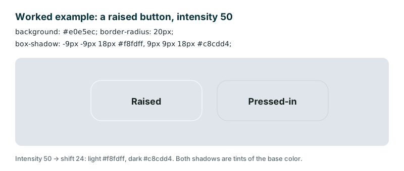
Flip the style to pressed and the same two shadows get the inset keyword, so the button looks carved into the surface instead of raised out of it. At intensity 100 the shift reaches 48, giving a pure white light shadow #ffffff and a dark shadow #b0b5bc — stronger, but also harsher, which is why 50 is a safer starting point for everyday controls.
Frequently asked questions
What is neumorphism?
A soft-UI style where elements look extruded from the background using two shadows — a light one and a dark one — with no border and the same fill color as the page. It was popularized by mobile and dashboard designs. The effect depends entirely on the shadows matching the background color, which this tool keeps in sync for you.
Why does my neumorphic button look flat?
Usually the shadows are too weak, or the background color does not match the element exactly. Both shadows must be tints of the same base color, and the distance must be large enough to see. This tool keeps them in sync for you — raise the intensity and distance sliders until the shape starts to lift off the page.
Is neumorphism accessible?
It can be a problem: the style is low-contrast by design. Use it for decorative surfaces, but keep text, icons and focus states high-contrast, and never rely on the shadow alone to show that a button is pressed or disabled. Pair it with a visible label or an icon so the control is clear to everyone.
Does it work on dark backgrounds?
Yes, with darker shadow tints. Pick the dark preset here — base #2b2f36 — and the tool derives suitable light and dark shadows from that base color automatically. The same distance, blur and intensity sliders apply; only the tints change, so a dark soft-UI card feels identical to a light one.
Is anything uploaded?
No. Everything is computed in your browser and nothing leaves your device. The colors, sliders and copied CSS are all local, so your design stays private until you choose to publish it, and no server keeps a copy of your work.